It is always other factors that cause his administration's failures. It is the fault of the Bush administration, it is the fault of the Japanese tsunami, it is the fault of Congress, it is the fault of the Republicans, it is the fault of the Tea Party, it is the fault of ATM machines (that eliminate jobs), it is the fault of the Constitution, etc. A true leader would deal with the reality of the present situation and look to move forward with solutions rather than wasting time and energy looking backwards for blame.
But who is really to blame for our country's economic situation of high unemployment, high national debt, out of control government spending, etc.? Are all of our nation's woes directly attributable to one man and only one man, namely George W. Bush as the Democrats claim? Did Democrats Nancy Pelosi, Harry Reid, and Barack Obama have nothing to do with our economic plight? Is the Obama administration dong anything positive to get us out of the economic malaise?
One way to analyze these questions is to look at reality. In other words, let's look at the data. Rather than deal with opinions, politics, and biases, the reality is in the numbers. Most of the numbers and graphs that follow are from official U.S. government sources. The data does not come from Fox News, tea party organizations, or the Republican party. You can argue politics and opinions, you cannot argue the historical numbers.
Disclaimer #1: up until the November, 2010 midterm elections, I had never voted for a Republican for national office in my life, I am 58 years old. I was nowhere close to being a fan of George W. Bush. His Presidency and associated antics were the main drivers and inspiration behind my writing, "Love my Country, Loathe My Government."
Disclaimer #2 - The following graphs of data and reality are in different forms since many times I could not get my hands on the original data and had to lift the graphs in the format they were in. Thus, I apologize for the inconsistency of the look of the graphs but the data and the reality they portray are accurate.
You can double click on any picture to blow it up for a better view.

The above graph displays the amount of absolute dollars the Federal government spent beyond the amount of money it collected in taxes and fees since the 1990s. One of the constant accusations this administration throws at the Bush administration is that the so-called Bush tax cuts caused massive budget deficits and caused the economy to crash.
However, based on the reality of these numbers in this graph, that is an apparently erroneous accusation to make. While the Bush tax cuts did reduce tax rates substantially, it apparently did not result in ballooning Federal deficits. In fact, as you can see from the graph, the annual deficits were actually decreasing during the middle of the Bush Presidency and were usually in line with the deficits early in Democrat Bill Clinton's Presidency.
This is a true statement until the November, 2006 midterm elections take place and the Democrats take control of Congress. They did not take office until January of 2007 and could not significantly impact government spending in 2007 since that 2007 budget was already set in 2006 when the Republicans controlled the White House and Congress.
However, look what happens after 2007 when the Democrats control Congress and the Federal budget (as illustrated by the vertical line in the graph) and then add the White House to their control in 2009. Deficits skyrocket on the Democrat's and Obama's watch, reaching heights that are multiple times higher than any Bush administration deficit. Thus, if deficits are bad, most of our deficit damage has been done when the Democrats and Obama controlled most parts of the government.
Bush can be faulted in the last two years of his time in office for not reigning in 2008 and 2009 budget deficits coming out of a Democratic Congress. But under the Constitution, Congress finalizes the budget for the government and that was under the control of Democrats Nancy Pelosi and Harry Reid.

This graph is a slightly different way of looking at the Federal government's deficit spending. Rather than just looking at absolute dollars, this graph looks at annual budget deficits as a percentage of our GDP. The reason to look at this ratio rather than the absolute dollar view is to see if the nation's economy is big enough to handle the actual dollars being overspent.
For example, if your household budget is $10,000 and you overspend it by $5,000, you have a 50% budget deficit, not a good thing. However, if you have a $100,000 household budget and you overspend it by $5,000, it is only a 5% budget deficit and is much more manageable.
At the Federal government level, this ratio graph shows us basically the same story we discussed above. The budget deficit situation was improving through the middle of the Bush administration and was in line with the historical deficit to GDP ratio performance. In fact, this measure of deficit spending was actually better than Clinton's performance early in his administration.
However, once the Democrats take control of Congress in 2007 and the Presidency in 2009, the government's deficit ratio skyrockets to orders of magnitude larger than those run up during the Bush administration. Tough to blame Bush when he did not control much of the the Federal government over the past five years of budget deficits.

This graph does not look at deficits but calculates a ratio of government spending as a percentage of our GDP. The theory behind this graph is that government spending is a relative measure. You can safely spend more if the economy is large and growing.
Historically, this ratio of Federal government spending to GDP has stayed around 35% both during the Clinton and Bush administrations and administrations prior to them. However, once the Democrats take control of Congress and the White House, this ratio goes haywire in the wrong direction with government spending growing significantly as a percentage of GDP.
Again, Bush can be claimed for not keeping a Democratic Congress's spending under control but it was the Democrats in Congress, and later the white House, that have allowed the reckless spending to grow unabated.

President Obama made the now infamous claim that if the country did not spend $800 billion in economic stimulus, the nation's unemployment rate could soar as high as 8%; He did get to spend and waste that $800 billion and the unemployment rate soared well past his 8% ceiling and has stayed well above 8% for a very long time. Is that the fault of the Bush administration?
This graph would indicate probably not. The unemployment rate was actually coming down throughout the middle of the Bush administration and for several years was actually lower than the unemployment rate during the Clinton years.
However, the same phenomenon occurs once the Democrats take control of Congress in 2007. Within a year, the unemployment rate is rising, once the Democrats in Congress can start implementing their agenda and budgets and skyrockets once the Democrats take control of the White House. If Bush is to blame for today's high unemployment, as Obama would have us believe, than Obama, Pelosi, and Reid also have to take a lot of the blame since Bush has been gone for over three years, the Democrats have not.

As the graph shows for almost thirty years, the average price for a house in the U.S. was pretty steady at about $150,000 with maybe a small upward trend inherent in the data. However, towards the end of the Clinton administration, housing prices begin to move off of that historical position and start trending dramatically and dangerously upward, resulting in a housing price bubble that bursts in the 2007 - 2008 time frame as the country's economy implodes.
Given that Bush was President for most of this bubble it is difficult to blame anyone else but his administration and the Congressional people at that time. It amazes me that no one in the Bush administration, the Treasury Department, The Federal Reserve, Fannie Mae, Freddie Mac, Housing and Urban Development, Senate housing and banking committees, House of Representatives housing and banking committees or anyone in the massive Federal bureaucracy did not look at a chart like this in the 2004 - 2005 time frame and say, "We have a problem." Didn't the Bush administration or some part of Congress have at least one smart economist on staff that could have recognized what now looks like a classic economic bubble and raised some red flags?
The Democrats, however, do not get off scot free on this major scree up. The Bush administration tried dozens of times to get strong regulatory oversight of the two Federal housing giants, Fannie Mae and Freddie Mac, significantly strengthened. However, Congressional Democrats always blocked that necessary move, mainly because Fannie and Freddie's executives made sure that large campaign money donations constantly flowed to Democratic politicians. One has to wonder if the Great Recession might have been less severe if Bush had not failed in getting his regulatory request instituted.

This graph depicts the number of Americans employed in non-farm jobs as a percentage of the total population. If you look at the Bush years, you can see the big drop in employment as a result of the 9-11 attacks and the resulting recession early in his Presidency. However, by the middle of his time in office, employment is improving steadily until the Democrats take control of Congress in 2007 and start enforcing their agenda and plans.
Before you know it, by 2008 or so the employment rate is in free fall and has continued since then, during a time when the Democrats controlled both parts of Congress and then the White House. Got to put most of the blame on this one on Pelosi, Reid, and Obama.

This graph is just another view of unemployment over time, this one based on monthly data. Things are improving steadily, year over year, month over month, under Bush until the Republicans lose control of Congress in November, 2006, the vertical line. Within a year of the Democrats taking over Congress, the monthly unemployment rates starts to climb steadily and only recently has started to nudge slight downward. Are we seeing a trend year, three years after Bush left office and five years after the Republicans lost Congress?

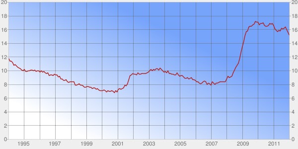
This graph depicts the Labor Department's Series monthly U6 tracking of underemployment in the U.S. Most of the time, the press and the political class only report the regular unemployment rate which is the ratio of people actively looking for work divided by those that are looking for work and those that have the work they want.
However, this usual tracking of unemployment does not include those Americans that are working part time but want full time work (the underemployed) and those people that have grown so frustrated looking for a new job that they have given up the search. This U6 series gives a far better and more complete picture of the bad employment situation int he country.
However, the trend is the same. The more robust U6 unemployment rate is trending downward significantly during the middle of the Bush administration, things are looking good. However, as soon as the Democrats start to assert themselves in Congress and then the White House, this measure of unemployment soars up towards 18% and has come down only sightly. It now stands at around 15%, almost double what the more commonly used, but less accurate, measure of unemployment is. This dubious level of 15% has been reached three years after Bush left office.

Hang in there,we are almost done. This graph appeared in a post from last week and it measures something called the Index of Economic Freedom. This chart tracks the economic freedom ranking in the world of the U.S, over the past three Presidential administrations. The lower the number the better the rank of a country relative to others in the world when it comes to economic freedom. Economic freedom is highly related in a positive way to wealth of a country's citizens which is a good thing.
But even though this is not a government data series, it comes from an independent private organization, the results are the same. Our Index Of Economic Freedom is improving, on average, as we move from the Clinton administration through the Bush administration and then takes a pretty dramatic and negative turn up once the Democrats take over Congress and the White House.
Our economic freedom then begins to weaken vs. the rest of the world. This may explain some of the economic malaise we are living through today.

One last chart and this may be the only one you need to know. Consider the five years from 2007 through 2011. During those five years, the Senate was run and controlled by the Democrats all five years. During those five years, the Democrats ran and controlled the House of Representatives four years. During those five years, the Democrats controlled the White House for three years.
Thus, in fifteen years worth of governing (five years for the Senate, five for the House, five for the Presidency), the Democrats were in charge in twelve of those years or 80% of the time. That is what is depicted in the above pie chart in blue. The Republicans, in red, were in control of only 20% of the Federal government from 2007 to 2011.
Thus, Obama's constant harping that the Republicans and Bush are the reason the country is in a ditch today really has no justification in reality. The Republicans have controlled only 20% of the Federal government since 2007, the Democrats 80% so logically, who really is to blame? All of the deficit measures, unemployment measures, employment measures, and government spending under the Bush administration were consistent with historical norms and improving until the Democrats took over Congress. Our Index of Economic Freedom ranking was improving until the Democrats took over Congress and then the White House.
The reality is both parties have screwed up the country but the data strongly suggests that the Democrats and their leaders, Obama, Pelosi, and Reid, have to take the majority of the blame. The numbers and data do not lie.
However, I could forgive the President for blaming everyone else if he would just do two things: stop the whining and start the process of fixing what he and the Democrats are mostly responsible for breaking. Looking backward accomplishes nothing. Looking forward for progress is a greater measure of what a leader does rather than looking backward for blame.
Thus far, based on the President's blame game, he is not a leader. He has shown himself to be just another ordinary Chicago politician who never apparently heard the old saying: "Don't tell me how rocky the seas was, just bring the darn ship in." In other words, "Don't tell me how bad things are and who is to blame, just fix the problems as they exist today."
We invite all readers of this blog to visit our new website, "The United States Of Purple," at:
http://www.unitedstatesofpurple.com/
The United States of Purple is a new grass roots approach to filling the office of President of The United States by focusing on the restoration of freedom in the United States, focusing on problem solving skills and results vs. personal political enrichment, and imposing term limits on all future Federal politicians. No more red states, no more blue states, just one United States Of America under the banner of Purple.
The United States Of Purple's website also provides you the formal opportunity to sign a petition to begin the process of implementing a Constitutional amendment to impose fixed term limits on all Federally elected politicians. Only by turning out the existing political class can we have a chance of addressing and finally resolving the major issues of or times.
Our book, "Love My Country, Loathe My Government - Fifty First Steps To Restoring Our Freedom And Destroying The American Political Class" is now available at www.loathemygovernment.com. It is also available online at Amazon and Barnes and Noble. Please pass our message of freedom onward. Let your friends and family know about our websites and blogs, ask your library to carry the book, and respect freedom for both yourselves and others everyday.
Please visit the following sites for freedom:
http://www.cato.org/
http://www.robertringer.com/
http://realpolichick.blogspot.com/
http://www.flipcongress2010.com/
http://www.reason.com/
http://www.repealamendment/


No comments:
Post a Comment